Ideas and Imagery #106

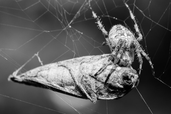
Every once in a while you find the time to try something different.  I went outside in my backyard and came across this spider enjoying its lunch.  This moth was at least an inch long, which I'm sure made for a small feast for this spider that is at least a quarter of its size.

Taking macro photos requires really fine technique as the margin for error is really small.  Factors like wind and camera vibration are magnified at this scale, making even small movements stand out.

It's not to say that there is a lot of luck involved, but you have to have a solid idea of what the technical limitations of your equipment are.  You have to take your time and be deliberate.

Other macro shots I've taken have suffered from my lack of patience and in trying to take shortcuts.  Here I spent the time, made sure everything was set up to maximize my chances for success, and was happy with the results.
Tiles #6

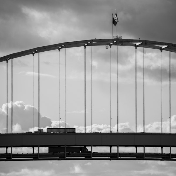
My impetus for the shot was the background clouds that made the bridge seem as though it was either floating or suspended at an extremely high elevation.  My focus was on the two passing semi trucks and I waited to snap the photo until they converged.  When I got back home to go through the day's photos there was a lot going on here that I was really pleased with. 

The photo contains a significant number of objects in pairs.  Cables, flags, road decks, and even the configuration of the vehicles (van followed closely by a semi, and tailed at a distance by another car) are shown in pairs.

Converting to black and white also helped to eliminate the blue sky and bring out the many tones in the image.  I love that the trucks are heading opposite directions, one in shadow and the other in light.

It's a fun image that is as much planned as it was a product of being there with my camera in hand...in other words a solid shot that turned out better than I anticipated.

Ideas and Imagery #105

I've never really tried to shoot still life images.  I really enjoy the process of looking and searching for images in my surroundings.  Still life photos are as much about the arrangement of the subject and the story element as they are about taking the photo itself.

It's not to say that I didn't enjoy the setup for this photo, which I was pretty happy with when it was all said and done.  I wanted to create a scene that looked like it was found instead of staged, and I felt like I accomplished what I was looking to do.

This scene is rooted in truth, and it is one I have actively participated in as a playmate for my kiddo.  Everything had a place with the exception of the rabbit, which was placed in several different configurations until I felt it was well-lit and haphazard enough to seem natural.

I probably won't delve too far into this type of photography anytime soon, but this shot gives me confidence that on the occasion that I do, I should be able to produce results I am happy with.

Ideas and Imagery #104

In Newport, this neon lunch sign aptly labeled the scene within.  It isn't like their activity isn't obvious, but sometimes you need a sign to draw your attention where there is something to see.

Being framed in widescreen, the lunch scene had a cinematic feel and the gesture of the conversation is one that plays out millions of times a day.  I am glad I was able to catch it before they broke for commercial.


Tiles #5

This was the first successful shot I made for my Square Assignment.  The stairway on this loading dock accented with the yellow paint was what originally caught my eye and I was able to build upon the composition from there.

Cropping square allowed me to create shapes within shapes, revealing squares in the small section of stairway and the brown wall above the yellow loading dock, and more rectangles than I can count.  Only a handful of round shapes can be found throughout the image.

Once I had taken this shot, I had a much better idea of what it was I was trying to achieve with the square assignment and subsequent shots came much easier.  In total I took at least five shots this day that are a part of either my square or compressions projects.  It was a great start.

If only all projects would start off this well!

Ideas and Imagery #103

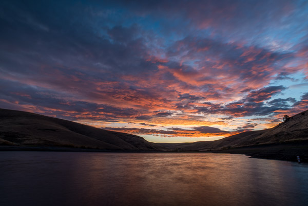
This is a color counterpart to an image I posted in my Ideas and Imagery #90 blog post.  While this is a later shot on the same morning, I feel like the color treatment was more suitable here.

Colors dominate here to good effect with support provided by the reflection in the water.  The hills help to separate the sky and water, providing a stark contrast to the brightness of the sunrise.  Shadows, while heavy are not totally black, giving the hills shape and adding a sinuous horizon line to frame and contain the sky full of haphazard clouds.

This isn't a destination that people seek to shoot.  It is a sight that locals probably know well.  Some likely love it while others likely take for granted that on any given day, a place you have seen 50 times can still surprise you with how pretty it can be.  I was thankful for the chance to see it.

Tiles #4

This was one of my more inspired shots from my On Taking Assignments project.  I used a flash to light the coins inside the jar with a little sidelight, and it added enough definition to the quarter to make it stand out while also providing enough diffused light to show the rest of the coins.

I Knew immediately that this photo would end up square in order to make it fit the confines of the glass jar.  I didn't want to see any of the area outside the edge of the jar.

The blur that the bottle lends to the coins outside the opening help to bring the viewer front and center on the quarter, and the distortion of the bottle makes the contents hard to discern without the relief of the in focus coins in the center.

I also shot a few pictures with a wide angle lens to see what the coins would look like.  It was interesting, but not near as interesting as this shot as the wide angle shot made the coins look like they were a mile away.

It might have been more true to how money always seems far away in real life, but in the end this picture is more optimistic.

Tiles #3

This photo was taken along the Columbia River Gorge at the end of a spring day.  The shape of the shadow was what caught my eye, and made it look as though there was a river of black ink flowing down.

It was great to see this scene in spring with its warm green and yellow tones.  I am fairly certain that the green only lasted a few weeks past this photo.

I've had a few people remark that they did or didn't like the inclusion of the electrical transmission lines and tower, but I think it provides a needed sense of scale and helps "ground" the photo for lack of a better term (pun intended, but reluctantly).

Ideas and Imagery #102

Flowers are beautiful, and we all see photos of flowers on a regular basis.  I have reached a point where I don't share that many flower photos, and when I do it really needs to be one that either strives to see them differently or where the photo eclipses the best photos of flowers I have taken in the past.

This photo for me accomplishes the former.  It is easy to get caught up in the total package of what makes a flower captivating.  For me, the color is usually what captures my eye first.  It's easy to get lost in that one single component.

I have started to convert some of my photos of flowers to black and white.  It's not that this flower isn't beautiful in color.  In fact the deep red color of this dahlia was incredible.  However, it's the structure of this flower that really grabs my attention, and in color, it's really difficult to focus on that aspect.

The contrast of this flower that is sidelit to the black background really helps to separate it from everything else around it and draw you into its complexity and detail.  Flowers are amazing just from a biological standpoint, and seeing that side of them in black and white helps to emphasize how interesting they can be.

Ideas and Imagery #101

This photo of a grain elevator was taken in Baker City in the evening just before sunset.  These old structures are simple and elegant, and I enjoy seeing and photographing them.

The ladder on this elevator works as a great pathway to lead your eye through the photo to the uppermost part of the building.  The shadows under the rungs of the ladder and the overhang of the roof add depth to what otherwise would have been a very flat image, and there is just enough shadow to the corrugated metal walls to add texture.

These types of photos that emphasize shapes and structural detail are very conducive to black and white processing.  On an overcast day this scene would contain very little color as it stands, so conversion to black and white was almost a foregone conclusion.

Even though this photo is simple, it's value lies in the use of good quality light to bring out its features and beauty.